17 August 2011

Better than your average holiday snaps


Hello my little blog-babies - this is a slightly shorter and less text-heavy post than usual, partly due to time pressures (team Hayward Publishing are hard at work on this at the moment) and also just because, y'know.. variety is the spice of life..

I am due to go on holiday at the end of this week and I'm not ashamed to say I am limping towards the finishing line. It's only four months since I last had a break but I'm as tired and run down as can be, so it's nice to take a moment, look at some great photographs and breathe a (vicarious) breath of fresh, Mediterranean air. The great photographs in question are by a young man named William Matthew Harvey, who also happens to work at Aperture Foundation - one of my favourite photobook publishers, and home of the very beautiful Aperture magazine.


The photos were taken near Lake Garda, in Italy - as if the warm light and hazy atmosphere in some of the shots weren't enough to tip you off. Sun-burnished buildings, vivid flowers and foliage, and rocky terrain all give you a sense of the landscape and climate, but what I like best about these photos as a series is that you really get the send of someone wandering - taking their time to explore a new terrain and taking pictures whenever something appealing catches the eye. Apologies to Matt if I grossly misrepresent his process here!


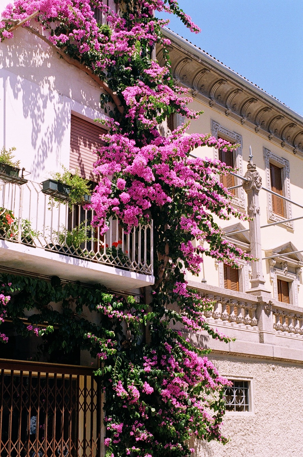
Considering that these are, broadly speaking, photographs of landscape, it's interesting that the photographer doesn't use that format much - focussing instead on the edges of buildings or placing some complex feature of the scene, like the creeping plant above, in the centre of the, vertically-orientated, frame. The images are all the more intense for it, and the partial views presented preserve the sense of movement or 'wandering' that I mentioned above, even when the subjects are static.


The photo above is definitely one of my favourites in the set  - the way this building is framed, and it's broad, brightly-coloured 'facing' is emphasized, really throws your attention onto the light effect of the low evening sun. It's a sensory image, in that you are made to identify with the building, leaning into the last of the day's light. I also love the way those fine cables and the filaments of the aerial are arranged in the top of the space - situating the building in space in really delicate fashion.


The expanse of warm rock above has some of the same effect as that beautiful yellow house - it can really be felt outside the frame, and, as a subject, is reclaimed from the stock, holiday-scenery background by it's scale and presence. Some of the images above also remind me, dare I say it, of John Gossage's interest in the boundaries between different kinds of space, not least the natural and manmade worlds.

Anyway, a big thankyou to Mr Harvey for allowing me to put these images on my blog and jot down some of my thoughts on them. I will leave readers with the image that best represents my feelings this week.. The holiday scene, so near yet so distant, obscured by the dark, obfuscatory foliage of the workaday week... Am I being suitably melodramatic? See you all on the other side, when I will return refreshed and hopefully less prone to the excessive prose..


12 August 2011

Just when I thought..

Semi Submersible Rig, 2007

..I couldn’t love the Whitechapel Gallery more, they go and put on this summer’s exhibition - Thomas Struth: Photographs 1978-2010. Weirdly, my mood was set by looking at the exhibition catalogue, which I usually do after coming out of a show (I have lots of strange, nerdy exhibition rituals, mostly to do with a childish desire not to ‘spoil’ the surprise of the work before I see it..) While waiting for a friend to arrive at the gallery, I took a look at this publication (which isn’t obviously a catalogue as much as a trade-focussed ‘survey’ of the photographer) and loved it enough to splurge a precious £30 on it.

It’s a large-format paperback, in a wide, square size you wouldn’t expect in this binding. The design – by Fernando Gutierrez Studio - isn’t ‘shouty’, it’s pretty understated in fact, but there’s something about the treatment which is strikingly original. The cover image, for example, isn’t an obvious choice, but the hi-tech industrial colour-palette of Space Shuttle 1 Kennedy Space Center  is very beautiful and deliberately engaging.  Inside, the plates are beautifully printed on one paper stock, and four substantial essays are printed on another, with an illustrated ‘list of works’ section at the back. From the perspective of someone who does this stuff for a living (a geek), this book is pretty inspiring and definitely the best catalogue I have seen for a long time.

Something else that struck me about the show itself was the generosity of the photographer – he speaks in the exhibition film, at length, about his practice and his working process, in detail and in the context of his studio. Struth’s insights into his work and inspiration feel very intimate – they seemed to chime exactly with the experience I had standing in front of the photographs, which leads me to feel that Struth has a very exact and finely-tuned sense of what his photographs do and how they do it. His description of the Paradise series and its effects, for example, seemed disarmingly precise. Standing in front of these huge, colour prints – dense, apparently unstructured scenes of tropical vegetation – I feel drawn into the viewing experience, into an act of looking which retraces the steps of the photographs making.

Paradise 36, 2007

Struth talks a lot about the viewer and about looking – particularly with regard to these jungle scenes. With nothing to ‘interpret’ as such – a jungle is a jungle is a jungle – the viewer is thrown back onto themselves, onto an awareness of where they are standing, what they are looking at and how they are looking. The effect is generous, thought-provoking and meditative.

El Capitan, 1999
He also speaks intelligently and informatively about photography and what it can do in other contexts – about exposing social architectures, the simultaneity of different strands of existence in urban life (his cityscapes), about the sublime, the way his pictures work, and about the function of art – it is, he says, a reconciliation with the past and a way of thinking about how we will move forward into the future; a way of making sense of, and coping with, the present. This joins up completely with my experience of the show and the photographs, which face up to subjects such as the overwhelming complexity and strangeness of modern technology, the abundance of visual cultures and even how families look and relate to each other in ‘family portraits’. All of the subjects are treated with a sort of intense, investigative gaze that is reflected in the way you have to look at the photos – there are clues and visual allusions everywhere that help you to read the photographs for history, social context and personal resonance, and to think through them.

Milan cathedral, 1998

Lots of reviews of this show have mentioned the same aspects of the work – it’s scale, Struth’s interest in architecture and human responses to the awe-inspiring or sublime. Few mention how subtle and warm the photographs can be. It’s awe-inspiring to stand in front of a ceiling-height photograph of the façade of Milan Cathedral, but it’s also interesting to note how the photographer pulls focus into the foreground, to where ant-sized tourists mill around the cathedral entrance. When Struth’s gallery photographs are hung, at full-size, so that you are on a level with the crowd of spectators inspecting great works of art in institutional settings, these images become involving rather than alienating, and witty with it – you recognise yourself in the works and their subjects. That’s the feeling that stayed with me after leaving this exhibition – I’d been looking at photographs, but they’d been looking right back.

Thomas Struth: Photographs 1978-2010
is showing at Whitechapel Gallery, London from 6th July – 16th September 2011. Tuesday to Sunday, 11.00–18.00; Thursday, 11.00–21.00; Entrance, £9.50/£7.50 concessions. All photographs used in this post are courtesy Whitechapel Gallery, London, and copyright the artist, Thomas Struth.

21 July 2011

Foto8 Summershow, London

Photo: Jane Stockdale

Now and then it’s refreshing to go and see a photo show that takes things back to basics. At the Foto8 Summershow this year, there’s no obligation to wade through a curatorial justification of the arguments, themes or influences behind the selection of work; nor do you feel like you’ve missed out on anything if you haven’t read a photo-critical tome before leaving the house. Those things might heighten your viewing experience of course, and all of this isn’t to say that the show isn’t serious or rigorous… but in reality, it’s this simple: Foto8 accepts submissions for the show in any style, size or format, with a remit to ‘engage or challenge the viewer’. This year, 1000 entrants answered the call with 2,853 images, out of which the team at Host Gallery and Foto8 magazine picked 150 to hang, ‘salon-style’, in the Host Gallery space.

The criteria for selection is ‘single image impact alone’, which might suggest that the single biggest danger for the curators is succumbing to the photographic equivalent of the ‘quick thrill’ – images that rely on shock value or tired visual tricks for their appeal. However, in the two years that I’ve visited the Summershow (it’s been running for four), I’ve found the opposite: the pared-down, almost ‘naïve’ curatorial mission statement results in a fresh, absorbing selection of works. The relaxed, open format of the show (which must belie some pretty furious organisational manoeuvrings) translates into a selection of photographs that feels contemporary, unpretentious and bursting with life.

Photo: Neil Craver

The style of the exhibition hang itself is simple and democratic – the walls are filled, floor to ceiling, with prints of different sizes and framings.  More significantly, in my opinion, and surprisingly, given the emphasis on photojournalism and reportage in the selection of work, none of the prints are accompanied by caption information of any kind – not the photographer, title or date of the works. To find this out, you have to refer to the little exhibition catalogue that is on sale (or on loan, in my, cash-poor, case) from the nice people at the Host gallery front desk. This, by the way, is also a complete steal at £2; all of the works are presented in full colour in the little A6ish guide, with more impact somehow than in the most lavish coffee-table books.. In the exhibition itself, this unfussy presentation does the extra work of giving back to even the most literal photographs some of their mystery, and throwing the viewer back on their visual responses to assess the work.

Photo: Sebastian Meyer
Going back to the ‘quick thrill’ problem for a moment; many of the works here, as previously mentioned, are photojournalistic. I love this kind of photography, but with certain exceptions. Not to diminish in any way the remarkable bravery and creative ability under pressure of documentary and ‘news’ photographers, but I personally find it frustrating, in an exhibition context, to be faced with images that are judged to be striking because their subject matter is so. Blood, conflict and explosions are all ‘dramatic’, but I often feel that these images are done greater justice in the context of series or editorial presentations. However, this one (probably mealy-mouthed) criticism of mine doesn’t apply to many works here and there is one – Sebastian Meyer’s ‘Smoke Screen, Zhani, Afghanistan’ – which really stood out for me in this genre, combining the presentation of factual, ‘documentary’ evidence with that essential ingredient, the ability to communicate thought and feeling to and through the viewer, by visual means. The smoke here is so thick as to be almost tangible; the individual soldiers are just the opposite of that – unindividuated. The photograph embodies, for me, how it might feel to be out in that smoke – without anchor or orientation and without visual identity. I’m not sure whether the thought is calming (the image is strangely calm, luminous) or terrifying.

Photo: James Morgan
My favourite works in the show are all photographs that have this communicative quality, and that’s leaving out the ones which are appealing simply for their beauty, their technical mastery or their enigmatic subject matter. It’s hard not to mention a photograph like James Morgan’s remarkable ‘Enal with Pet Shark’, from a series dealing with the lives of Indonesian sea nomads, in which the little boy of the title is shown gliding, grinning, through clear water, clinging to the tale of the shark with enviable confidence. Neil Hall’s photograph ‘After The Crash’ (given an ‘Honourable Mention’ by the competition judges) is also compelling, showing UKIP MP Nigel Farage staggering from the scene of a light aircraft crash in an otherwise banal rural landscape. The aircraft wreckage itself cuts through the composition, drawing our attention to Farage’s strange, contorted expression.


Photo: Lydia Panas
And… well, I could go on for hours. Revisiting the Summershow’s website the day after I went to the exhibition itself, I had the aim of restating to myself some of the themes’n’memes I had identified in the work at first hand – the lives of children, vulnerability, visual identity, the individual figure’s relationship with landscape. This aim dissolved as I came across one after another photograph that demanded analysis on its own merits. Some of my favourites include Lydia Panas’ portrait of the unidentified ‘Kitty, Christine and Kira’, shot in some indistinct rural location, the sense of transience the portrait evokes heightened by the way in which the photographer has caught her beautiful subjects at odds, posturally, with themselves and each other. Martin Osborne’s studies of ‘Dogs in Cars’ are strange, condensed snippets of fear and aggression, and ‘Untitled’ by Lydia Goldblatt is a glimpse of what a single, well thought out, frame can achieve in terms of encouraging the viewer to reach for narrative outside it. Seen as if through a door stood ajar, bare legs rise up out of soupy green bath water, facing towards an unseen light source as if the bather has stood to catch a glimpse of an unexpected dawn.

Photo: Lydia Goldblatt

What more can I say? It’s a joy to visit this exhibition and I heartily recommend it – four superbly qualified judges – Richard Billingham, Charlotte Cotton, Emma Morris and James Reid – have selected their official ‘Best in Show’, but my advice is to get down to EC1 and choose your own (not just for this reason)!

The Foto8 Summershow 2011 is on display at Host Gallery, 1-5 Honduras Street, London, EC1Y 0TH, from 8th July – 12th August 2011. Monday to Friday, 10.00–18.00; Saturday, 11.00–16.00. Entrance Free. A catalogue is available from the gallery shop for £2.

All photos courtesy of Host Gallery, London.

19 July 2011

State of the Union, Mitch Epstein


Photographs by Mitch Epstein. Published by Hatje Cantz.

State of the Union has the scope and character of a photographic 'Great American Novel' (even if it does not trumpet its status as such) and it's hard to avoid the description 'novelistic' when turning the pages of this handsome, thematically substantial volume. The comparison is somewhat specious, in that authorship here is the business of publisher Hatje Cantz and the Kunstmuseum Bonn - this is, strictly speaking, an exhibition catalogue rather than a monograph - as much as it is of the photographer. Strictly speaking (again) these photos also constitute two chronologically distinct bodies of work rather than one long narrative. However, the description seems to suit work that is as complex and eloquent, and as sensitive to the shifting relations of individual, social and natural scale, as this photography is. 


Epstein himself remarks in the engaging interview with Stefan Gronert, that he is working in 'a tradition of projects that address the idea of nation, and specifically America as a nation.' The two photographic projects presented form a coherent, intelligent overview of the artist's engagement with American life, both from a street-level, intimate perspective (more frequently in the earlier Recreation series) and from a wider, more emphatically detached point of view (in American Power). These series have been published previously as discrete monographs, but this volume makes plain how the artist's distinctive vision has persisted - and evolved - over time.

Prevailing characteristics include an ability to 'disappear' into a scene, enabling the photographer to capture intimate, even whimsical, moments in everyday life without the resulting image feeling either too staged or else incoherent. A photograph of four women crowded round an obscured object on the city sidewalk in Recreation, for example, is a cannily snapped piece of street theatre. A dense, hectic, unmistakably urban composition as well as a magical visual moment; four crazily-patterned dresses that are, the photographer knows, a joy to look at, though their owners strain to look elsewhere. There is also a genius for making visually legible the relationships between people and their neighbours, their belongings and their surroundings. In the earlier series, this skill manifests itself most obviously in portraits of groups of people, whether it be a family - strung out in a long line, each member subtly failing to connect either physically or by eye-contact with each of the others - or a crowd of Vietnam veterans, each individuated but not one detached or dispensable in terms of the composition. In American Power, an investigation of energy production, consumption and waste in the United States made in 2009, this skill transfers onto a (literally) larger canvas, where Epstein juxtaposes human beings (rarely individuals), their homes and their industry, all within the setting of grand American landscapes. 


It is hard to adequately convey the impact of these wide-angle, densely detailed landscapes, which document domestic American rituals, industrial apparatus and epic landscapes, often all within the same frame. The photographs individually become colder, both in mood and palette, partly as a result of the flattening effect that occurs when elements far and near - a golf course and a wind farm, in one memorable example - are given equal attention and brought into direct visual comparison. This is partly also, as both Christoph Schreier and Stephan Berg point out in their thoughtful, precise essays, because the photographer who was once in-amongst-the-crowd, close to his human subjects, has now distanced himself and resists the vivid, humanistic images he made in earlier, less pointedly political works. The cover photograph of this volume - from American Power, depicting an unfinished concrete bridge cutting through untamed countryside - seems to suggest that the 'State of the Union' is not necessarily cause for optimism; technologized but alienating, ambitious but without direction.


What is equally impressive, however, is the sensitivity and variety of Epstein's response to his surroundings and subjects, so that at no point do the photographs (or the book itself) become heavy handedly didactic or self-righteous. This is a point made variously by each of the three focused, analytical texts that have been contributed to this volume, as well as by the photographer himself, who states that he was keen to avoid a 'simplistic agenda' in American Power. The almost collage-like effect of some of these photographs - showing, for example, a glowing oil refinery at the end of a long avenue of trees, or a vast windfarm in the background of a sleepy small town - does not act simply as an indictment of complacent consumers, or a representation of the impassive face of big business. It is also a manifestation of the difficulties many of us face when confronted with 'energy issues', our blankness when presented with, as Stephan Berg puts it, 'the simultaneity of necessary energy production and the exploitation and destruction it wreaks.' 


The book itself makes light work of crafting an enjoyable, absorbing reading experience from two sections of dense, large-format photography, combined with a substantial amount of text in both German and English. The text is handled elegantly through a two-colour, highly readable design, and the two 'plate' sections are laid out in two distinct styles, contrasting the less consistent Recreation works with the more imposing, formal American Power. The only obstacle to the reading experience one may encounter is that the upright format of this book seems wilfully designed to disrupt the large square and landscape-format images - a deep gutter cutting right through the centre of some works. Yet somehow this 'human' orientation does not prove disastrously distracting. The format is dynamic like the work itself and seems to complement images that throw the reader back on his or her analytical skills, as much as on their appreciation for sheer aesthetic skill.

This review was originally published in photo-eye Magazine, 8th July 2011, and can be viewed in its original form here. All photographs are by Mitch Epstein, from State of the Union, published by Hatje Cantz, 2011.